
beverage union
The family resemblance runs deeper.
A shared identity connected a varied product range, its digital shop and its physical expression. Four disciplines carried the system across branding, packaging, the website and spatial design, with room for each family’s own character.
// brand design
The B and U come together as an interlocking monogram, with a shared module guiding spacing and scale. A neutral core and colour-coded extensions gave the varied range a recognisable family resemblance.
The identity guidelines reached beyond the mark into photography, iconography and the way the brand shows up. People stayed at the centre of the image direction, with the drink becoming part of a larger scene.
// product packaging design
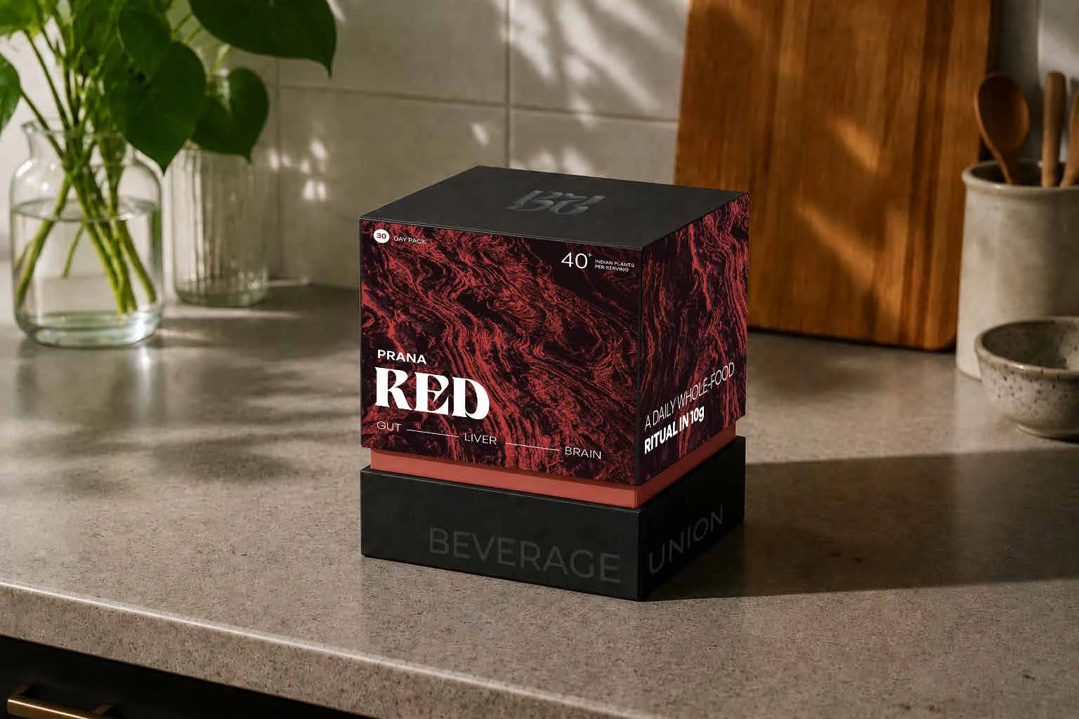
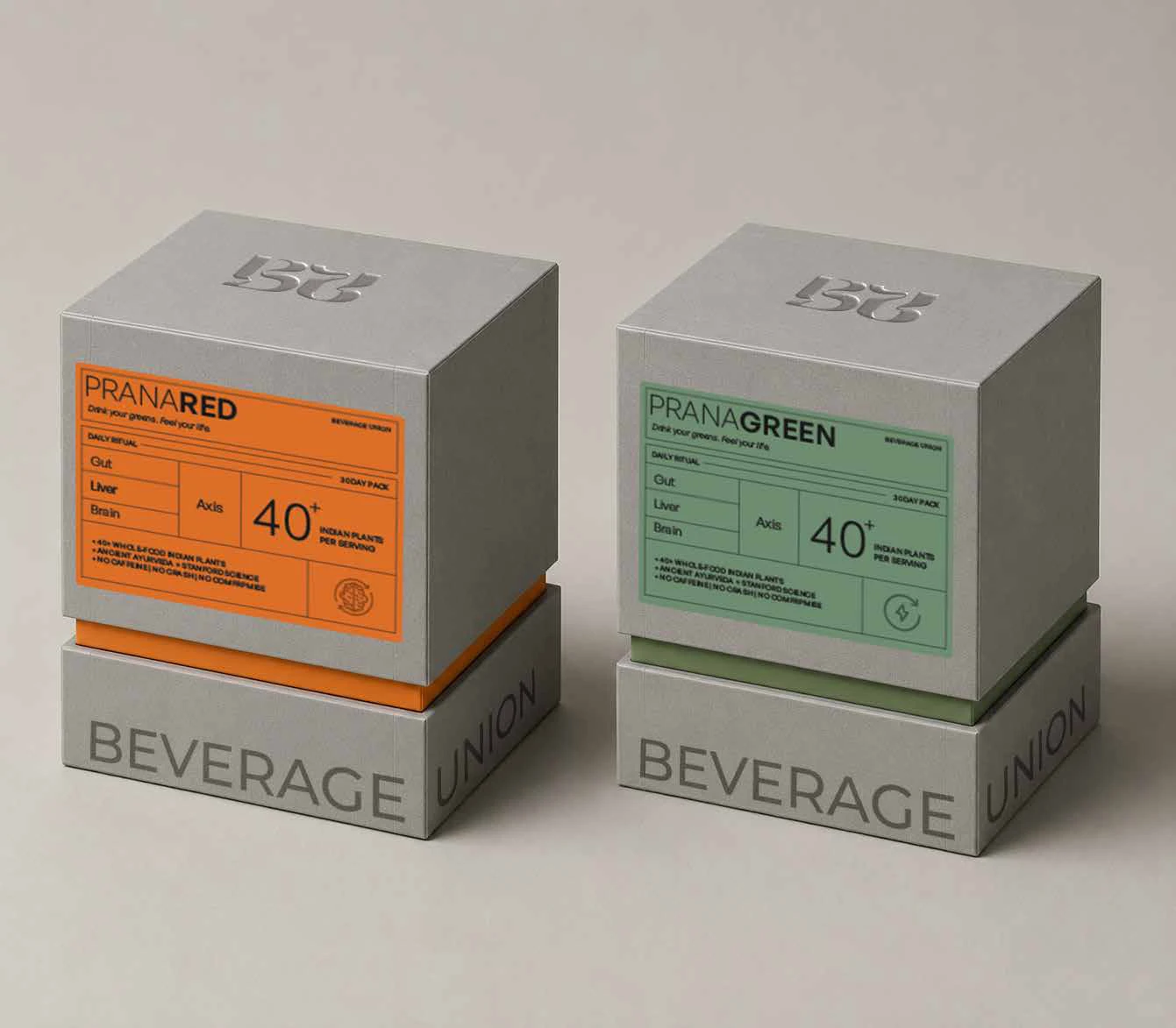
Abstract nature imagery gave Prana a visual language built from texture and light. The treatment made space for the individual variant while keeping the pack connected to the wider Beverage Union system.
Colour gradients and fine botanical linework gave the coffee blends distinct moods. Romance, Euphoria and Gravity could each stand apart while the shared packaging structure kept them recognisable as one family.
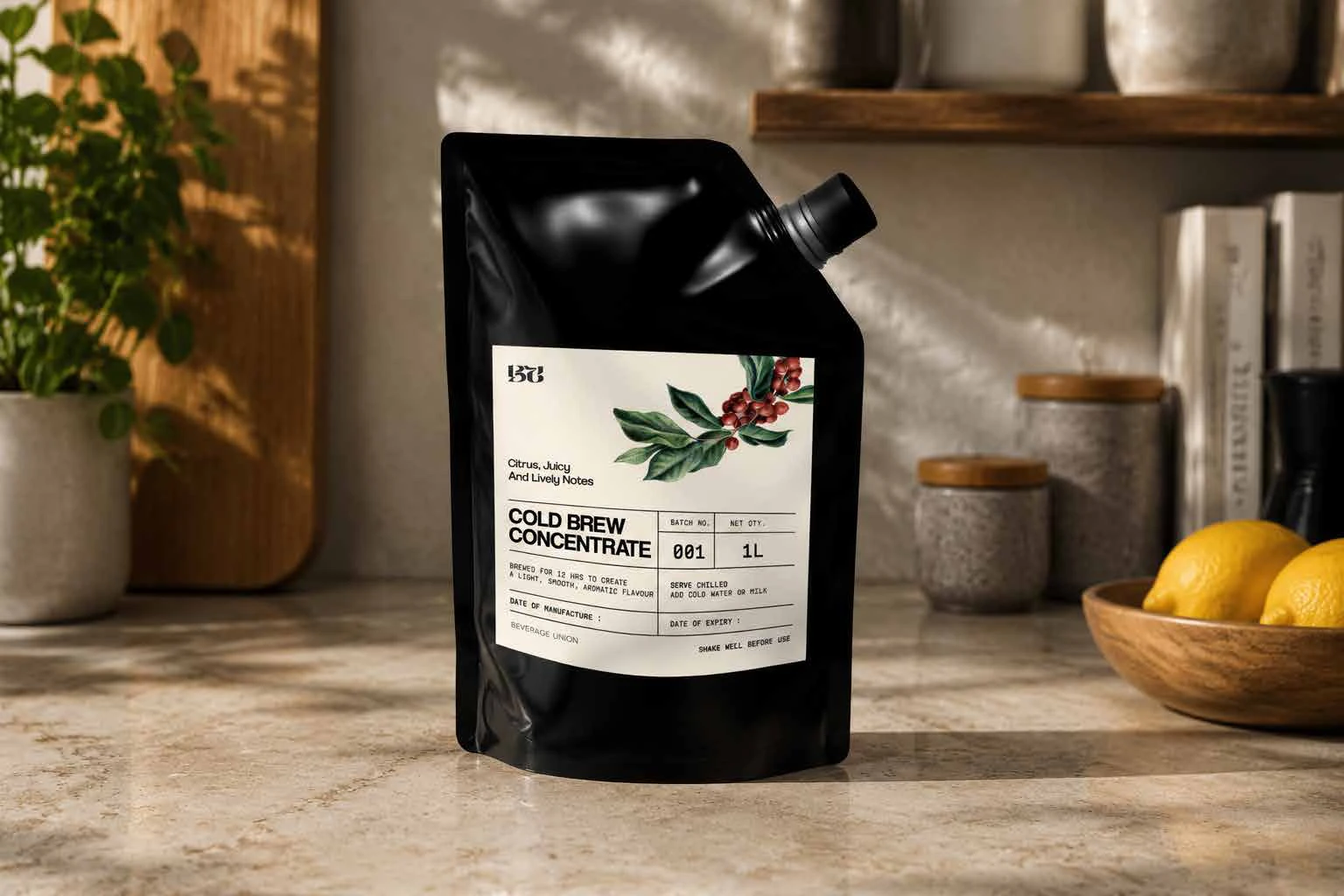
An archive-inspired label brought a functional information grid together with expressive type. Its structure could travel across containers, keeping product details readable while giving the packaging a distinct visual character.
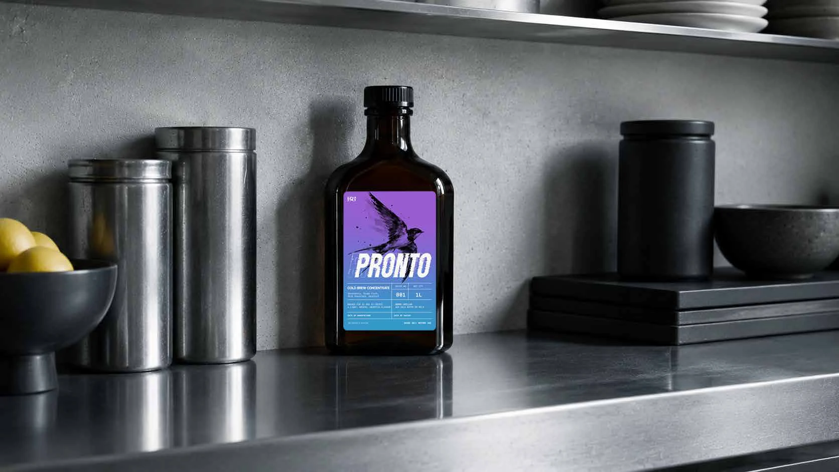
A swallow and a warm-to-cool gradient gave Pronto its own expression. The bottle carried the family’s shared identity, while the label’s colour and illustration made this part of the range immediately distinguishable.
Full-bleed botanical illustration gave the tea variants an individual presence. Deep backgrounds and large product names kept the packs connected, with the plant imagery doing the work of distinguishing one from the next.
Concentric and radial linework gave the tisanes a shared visual rhythm. Variants such as Soma and Surya took different colours and patterns, carrying the family structure into a more abstract packaging language.
The syrup range used colour, a restrained ingredient illustration and a prominent script name to separate flavours. The bottles could read as a family while giving each variant a clear place on the shelf.
// website design & development
The website and Shopify backbone organised a varied range into a usable structure. Routes by category, state and format informed the architecture, connecting the brand’s way of describing its products to the way people could browse them.
// spatial design
Spatial and architectural design carried the brand into proposed bars and F&B areas. Drawings and visualisations explored the counter, seating, surfaces and illuminated monogram, giving the identity a considered physical expression within the delivered brand package.